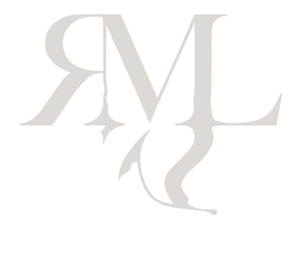
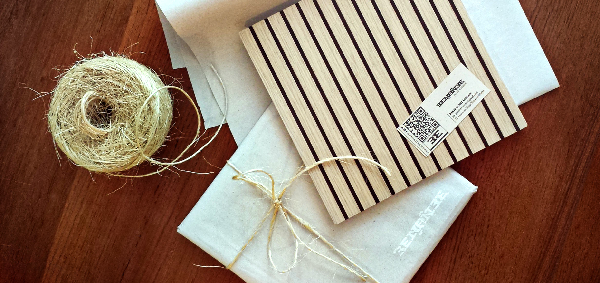

The "RE" from Renaître serves as an abbreviated ambigram icon for the brand.
Renaître Works
Client: Renaître Works
Deliverables: Product design, naming, identity design, photography, social media, marketing, sales management, copywriting
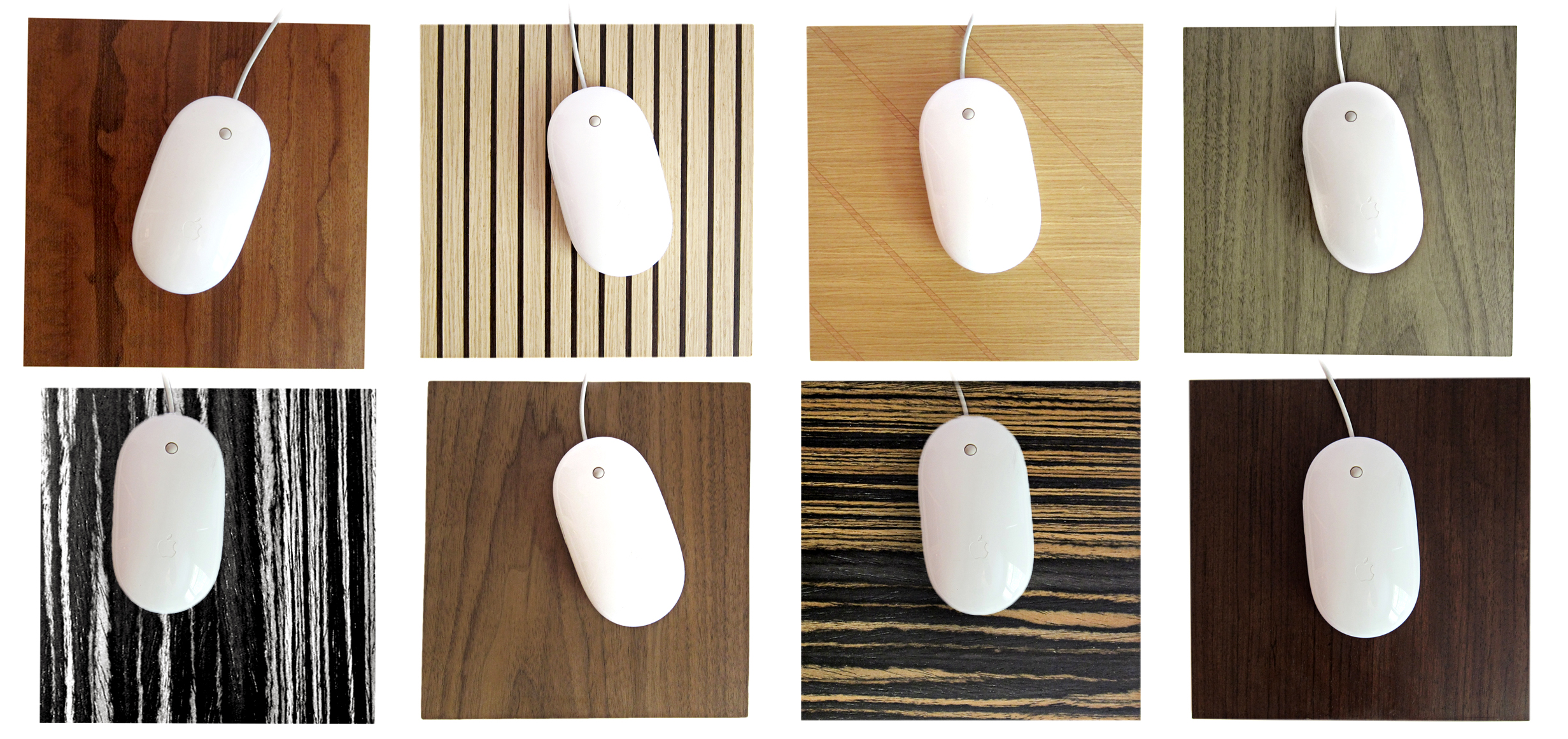
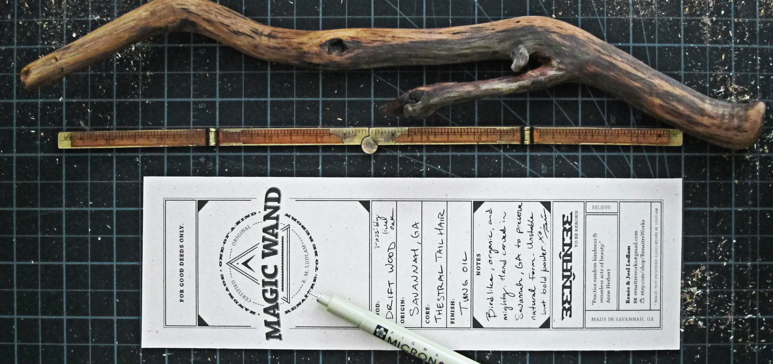
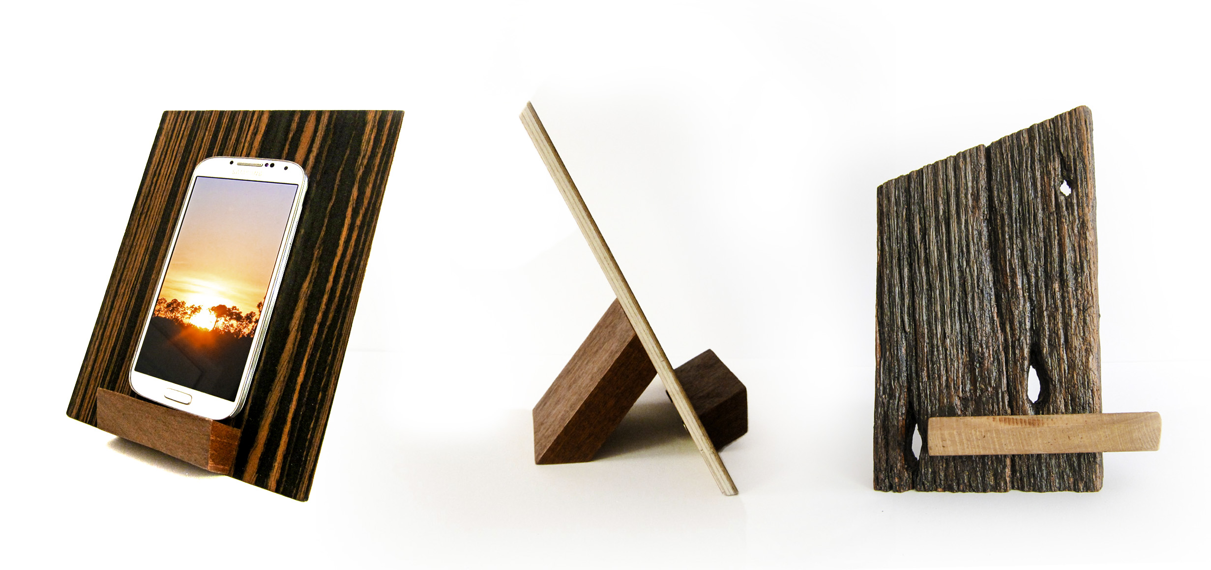
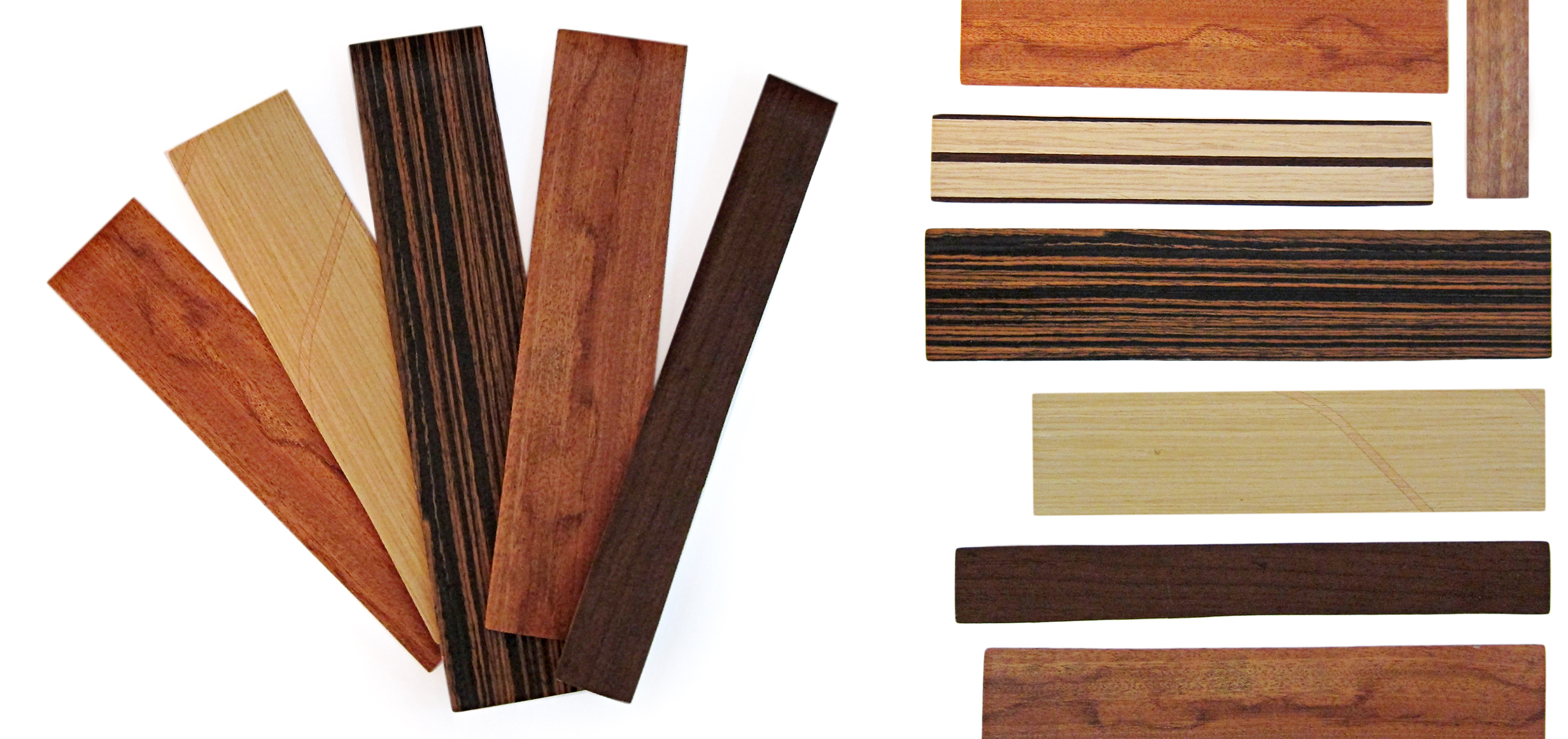
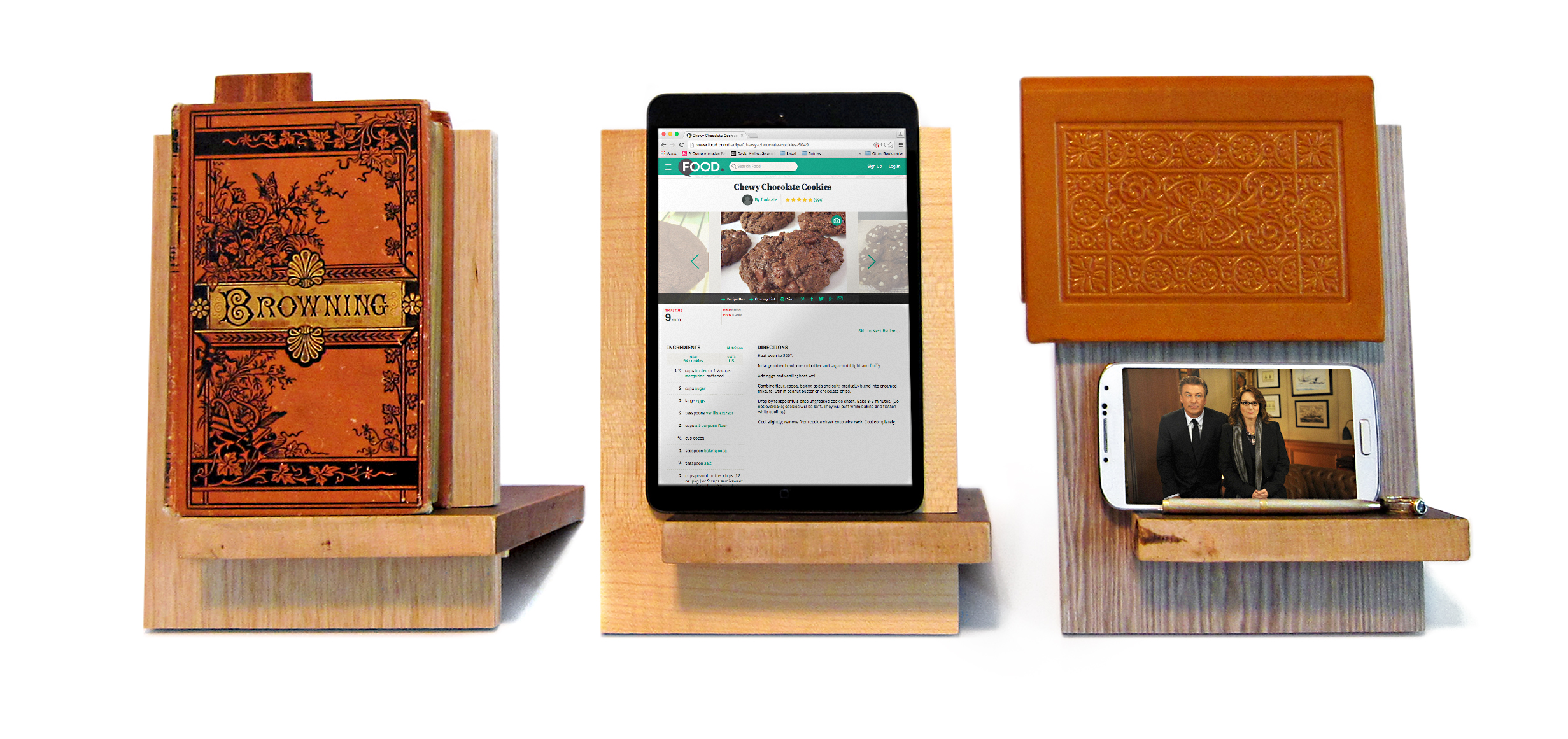
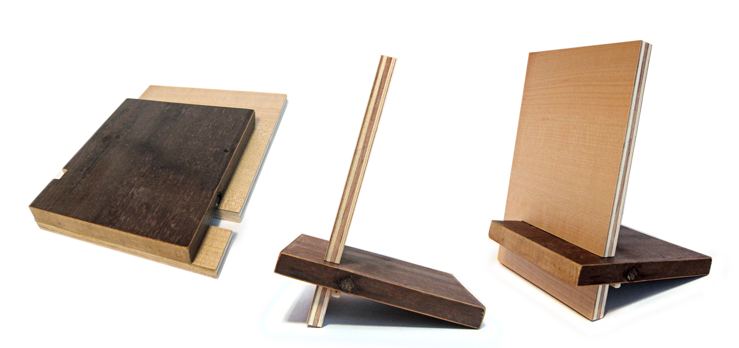
Objective: To reclaim a large waste stream of wood by designing and hand-making functional, beautiful, long-lasting products for the home and office.
Goals: To provide excellent customer service and quality products to a caring market; to design smart and simple products I can manufacture and sell as a side business; to build a following; to help educate others and inspire similar adaptations for waste streams in other areas.
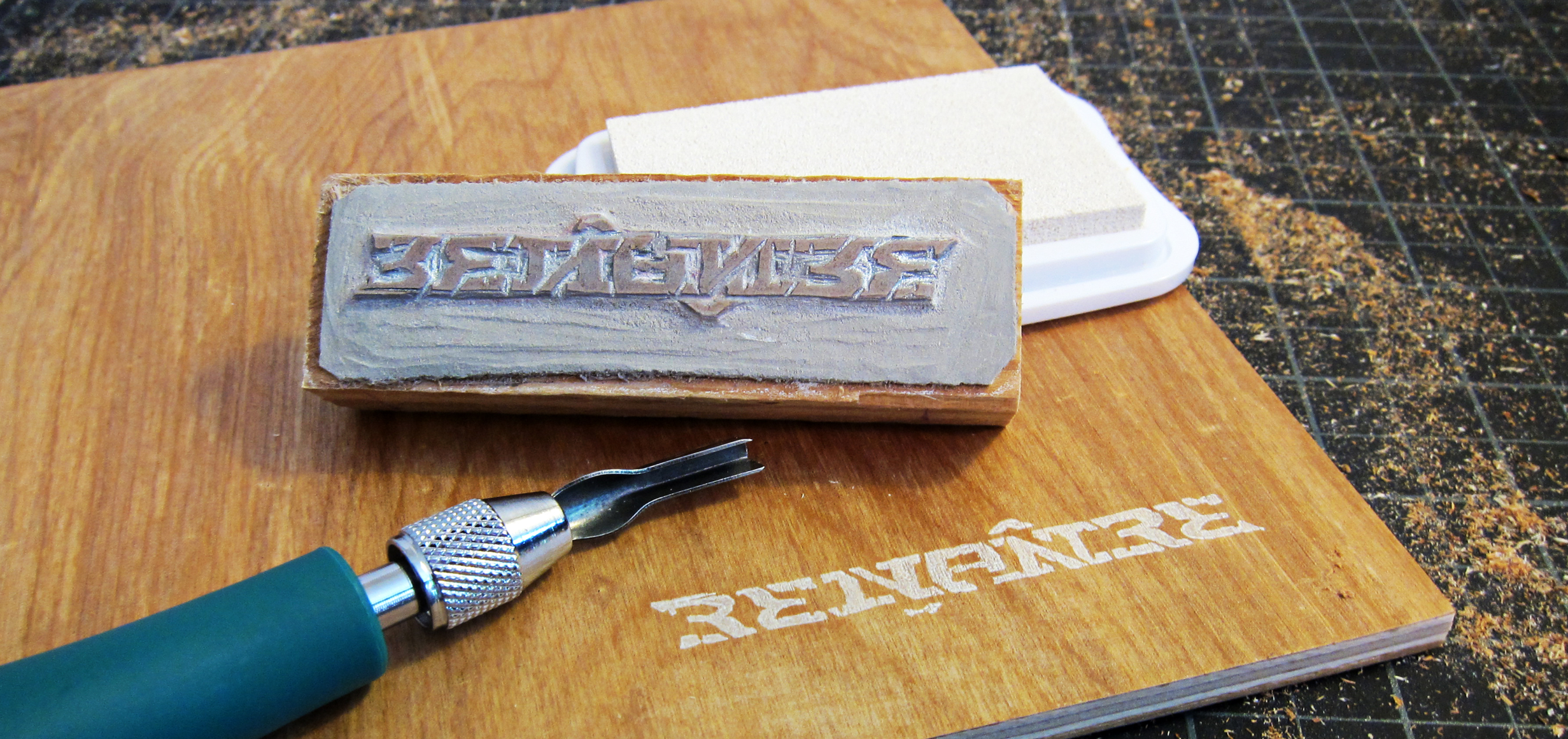
Solutions: Chose the name Renître, which means to be reborn or made anew in French. Built a wood-cut based ambigram logotype, which can be read upside down. Thus, it can be read from any angle. The name reflects the reclaiming nature of the work and the type carries the weight, wit, and meaning through it's repetitive forms. Designed and prototyped several products, refining as I went. Built each piece by hand, with the assistance of my husband. Launched a social media campaign and Etsy store after doing an in-person test run at a curated market. Have recuperated costs within the first months of opening.
Roles: Owner, industrial and graphic designer, copywriter, wearer-of-all-hats.